
Bent Image Lab’s Jun seo Hahm is working on a series of whimsical short animations entitledKarnival. The first two episodes are up already, with my clear favorite being “The Thing.” The next episode is due on September 1st.

Originally, Yves Geleyn had intended “Kotori” to be for the Tokyo Mode Gakuen. But when they decided not to pick up the project, he forged ahead anyway, sewing bits of tissue and cloth together to create an endearing little narrative about a bird who’s as persistent and creative as Yves himself.
Yves’ portfolio is full of hybrid approaches to animation and illustration. Ever sensitive to his subject matter, his creations are cute without being cutesy, and they always adhere to the narrative at hand. The result is a buoyant body of work that’s full of surprises.
By the way, the music and sound design in “Kotori” is from Mark Webster, with whom Yves has collaborated on several other projects. Mark runs a fantastic blog about motion design called… well… Motion Design. Check it out for thoughtful looks at the history and current state of motion graphics.
Yves is with Hornet in the US and Passion Pictures in Paris, where he is based.


While Flash may be the most ubiquitous media player on the web (more on Flash later), QuickTime is still the industry standard format for distribution. Some reasons for this:
Perhaps the biggest reason, tough, has to do with your audience. Your site is targeted at designers, producers, agencies and other video-savvy clients. Call it brand fascism, but QuickTime is currently the expected choice for distribution. Anything else (AVIs, FLVs or, god forbid, OGMs) are regarded with a mixture of suspicion and disdain.
It’s like wearing pink to a black-and-white party. Sure, that inner rebel in you wants to do it, but you’ll be standing alone in the corner nursing a stiff martini most of the night.
Using Fast Start with Compressed Headers
One more thing on the QuickTime tip: For god’s sake, please use fast start. If you don’t enable the fast start option when compressing your video, your viewers will have to wait for your entirevideo to load before they see the first frame. For longer form projects, like music videos and short films, this can be reason enough for someone to skip your project entirely.
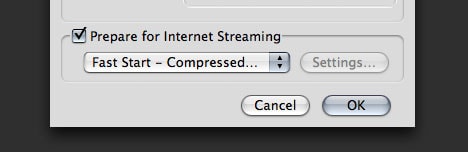
Using Fast Start is easy, but it requires QuickTime Pro (or Compressor). Here’s how to do it:
The compressed header option losslessly crunches your movie’s header information and allows for an even quicker playback experience than fast start alone. The only reason you wouldn’t want to use the compressed header option is if you expected someone to watch your QuickTime using a player that doesn’t support compressed headers (like Quicktime for Linux and/or older, lesser known players).
I don’t care about your mission statement. I don’t care about your innovative interface. And I really don’t care about your cute intro animation. I want to see your work. Fast. Two rules of thumb:
Your reel should be accessible in one click or less.
Either put it on your site’s entry page or prominently linked from there. There’s no compelling reason to bury it any deeper.A single project should be accessible in two clicks or less.
You might want to categorize your work. That’s cool. But one level of categorization should do the trick. I don’t want to click through “Portfolio > Motion > Abstract > Blue Period > Post-2001 > Containing the letter “J” in the title” just to see “Juggling Blueberries” (which I’m sure is totally awesome).Cut down on the navigation levels and push the work to the top. If you find that you have too much work for that approach, then you probably have too much work on your site. It’s a portfolio, not a basement. Only put your shining examples of brilliance online. A searchable archive is fine, but don’t put it at the same hierarchical level as your other stuff.
It’s 2008, people. Two thousand and EIGHT! 320×240 video was all the rage in 1999, but increasing monitor resolutions mean that 320×240 videos appear smaller than ever. (And they were damned small to begin with.)
The good news? Thanks to better codecs (specifically H.264 and Flash’s On2 VP6), faster servers, cheaper hosting plans and widespread broadband penetration, you no longer have to reduce your beautiful videos to postage stamp proportions.
Do yourself and your visitors a favor: Go big. If your current host can’t handle it, find another one.
I love Flash. I worked full-time as a Flash designer/developer for four years before I got into motion, and it seems natural to exploit its growing motion graphics capabilities for a motion graphics website. Just keep these things in mind:
Provide direct links to projects
Don’t make me send an email saying, “Click on Work and then scroll through the projects until you see a little red bird. It’s the video to the right of that one.” That’s crazy. Give me a link, just like Blacklist and Nervo do. It encourages people to share your work and that’s good business.Provide downloadable versions of your videos
“But I don’t want people stealing my stuff!” Trust me, encoding your video in Flash and not providing a QuickTime version isn’t going to stop people from stealing your stuff. There are countless ways to nab files without your permission. Instead, why don’t you step into the 21st century and provide a downloadable QuickTime that’s watermarked with your logo?Technically speaking, my favorite way to achieve this on a Flash site is by calling a PHP script with code like this or this.
Don’t forget search engines
Unless you explicitly take measures to avoid it, Flash content is hidden from your little invisible friends, the search robots. Widespread adoption of Adobe’s Search Engine SDKcould alleviate this issue in the future, but for now, do what you can to help the search engines out. It’ll come back to you.
There are countless other bits of advice I could offer, but they’re more about general web design practices, not about motion graphics websites. Up next in this series: the secrets of a successful reel and tips for compressing your videos.



conEdisonDesigned by Arnell Group, in 2000. conEdison is a US-based electricity supplier.
Canadian National RailwayDesigned by Alan Fleming, in 196o
http://www.logodesignlove.com/10-creative-monogram-logo-designs


